The starting artifact and the decision
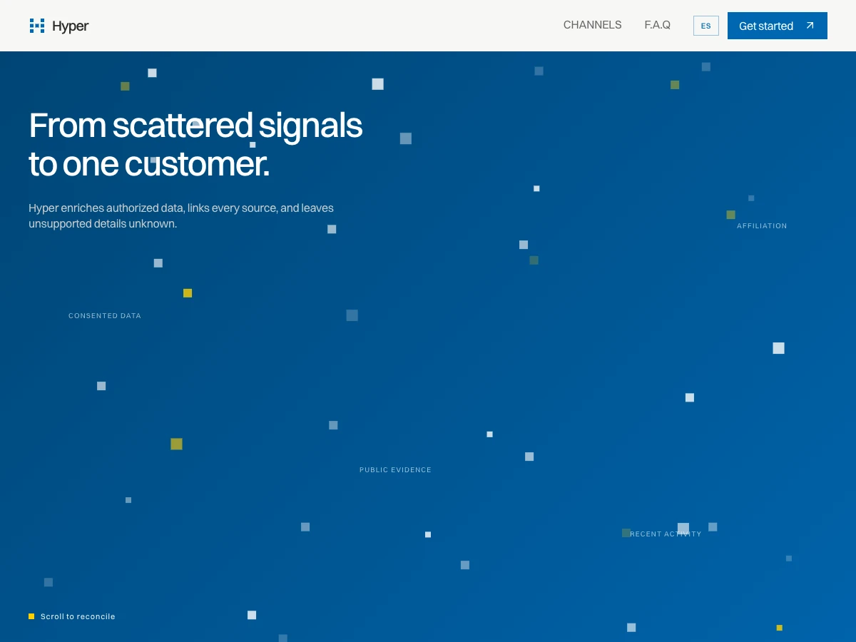
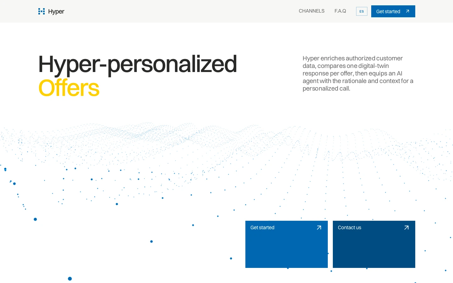
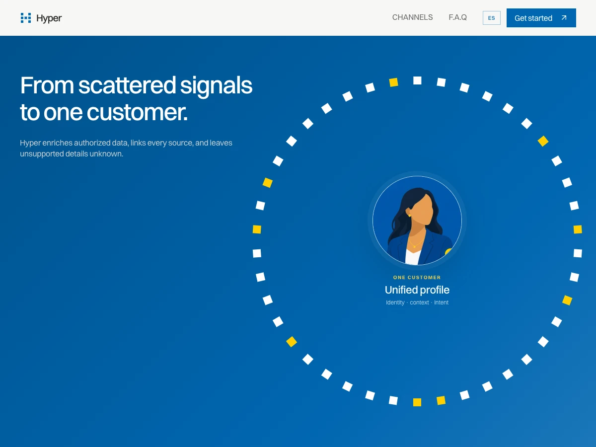
The published interface already has useful recognition: a blue field, a precise square signal mark, a central customer portrait and a sequence from scattered signals to one profile. Its strongest idea is not the color. It is the transition from fragmented data to a person a team can understand. A refresh should preserve that sequence and improve how it travels across a short landing page, a product demonstration, a sales deck and a compact mobile view. The hypothetical brief is to make one idea recognizable across those touchpoints without implying that the underlying prototype has acquired production customer data.
A proposed system, not a cosmetic swap
Keep the signal grid as the primary mark, but define a minimum-size version that survives favicon and navigation use. Reserve the saturated blue for the opening promise and active states; give evidence, examples and limitations a calmer surface with stronger text contrast. Use one typographic scale for the promise, data labels, caveats and action. Motion should connect signals, profile and suggested offer in that order, with a static three-frame alternative for reduced-motion users. The phrase 'one customer' is clear only if the supporting copy also says what sources are authorized, what remains unknown and what the demonstration actually does.
Touchpoint decisions
A refresh succeeds when the same idea survives a change of format. These are proposed artifacts and review checks, not delivered work or measured results.
| Application | Proposed decision | Acceptance check |
|---|---|---|
| Landing hero | Lead with the customer outcome, then disclose the synthetic demonstration | A first-time reader can explain the offer and the demo boundary |
| Product screen | Keep source, confidence and unknown states beside the unified profile | A profile can be interpreted without treating missing data as certainty |
| Sales and small formats | Use mark, one-sentence offer and one proof frame without animation | The identity stays legible at small size and in a static export |
What this study proves and what remains open
The published Hyper project supports the starting visual and interaction observations. This proposed refresh demonstrates how Dardo would separate recognition, message hierarchy and product proof before updating an identity. It does not establish a before-and-after performance result or a completed refresh engagement. A real commission would need stakeholder interviews, customer language, approved product claims, existing asset inventory, accessibility checks and an owner for the rollout. The first design test would compare the current and proposed first screen for comprehension, not claim increased sales from preference alone.
Sources & editorial notes
Sources
- Hyper — public experiencehyper-one-azure.vercel.app
How we built this guide
EvidenceThis guide combines 1 linked source, Dardo’s analysis and clearly labeled project examples.
LimitsVisible design and content decisions are not presented as measured ranking, traffic or conversion gains.
Read our editorial policy