What references from Colombia reveal
A useful Colombian website showcase has to reveal more than a fashionable home page. Buyers may be comparing a tourism booking journey, a cultural programme, and a responsive commercial site, so the editorial question is how clearly each interface organizes a real task. The three examples here were selected from reviewed first-party images already used in Dardo’s research library. SingleClick shows destination filters and tour cards for De Turismo por Colombia; PANCA Studio shows an event interface for Festival Cine Corto Medellín; Sodecompany presents a VitalVibe concept across phone and laptop. Those are different kinds of evidence, and none is treated as an independent performance audit. Look for a legible hierarchy, a clear next action, and evidence that the composition survives a smaller screen. Then move beyond the still image. A tourism site needs current availability and a reliable booking handoff. A festival site needs dates, sessions, venue details and rapid editorial updates. A service site needs persuasive proof and a form whose receipt reaches the right person. Colombian buyers should also test Spanish content, COP or other currency labels where relevant, accessibility, analytics and ownership after launch. Visual character matters, but the strongest reference is the one whose underlying system matches the work being commissioned.
These references are presented for design analysis and inspiration. This is not an audited ranking, a quality certification or a claim that Dardo created or measured the featured work.
Three website references to study
01 / SingleClick
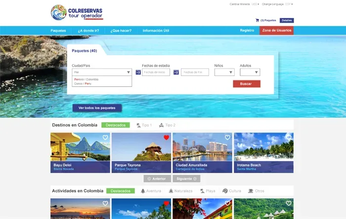
De Turismo por Colombia booking interface
What stands out
The reviewed first-party portfolio image shows De Turismo por Colombia with destination filters and tour cards. Unlike a generic studio card, it exposes a recognizable customer task: finding an option inside a tourism catalogue. The composition uses repeated cards to make destinations comparable and places filters close to the inventory they affect. That is useful design evidence, while the still does not show availability, keyboard behavior, empty results, checkout, confirmation or the current live implementation. SingleClick publishes the image on its official web-design page, so the attribution is clear; this editorial observation does not claim measured conversion, accessibility conformance or that every part of the wider booking system belonged to one scope. A buyer should follow the source and ask for the full path from filter to verified reservation.
Use the card-and-filter pattern only after defining the inventory and booking truth. Ask who supplies destinations, prices, availability and cancellation rules, how filters behave with no results, and where payment or reservation data goes. Test the complete task on a phone and keyboard, including slow loading, errors and confirmation. Confirm SingleClick’s role and the current status of the example rather than assuming it from the image. Put catalogue editing, analytics, integrations, accessibility and support into the acceptance plan.
02 / PANCA Studio
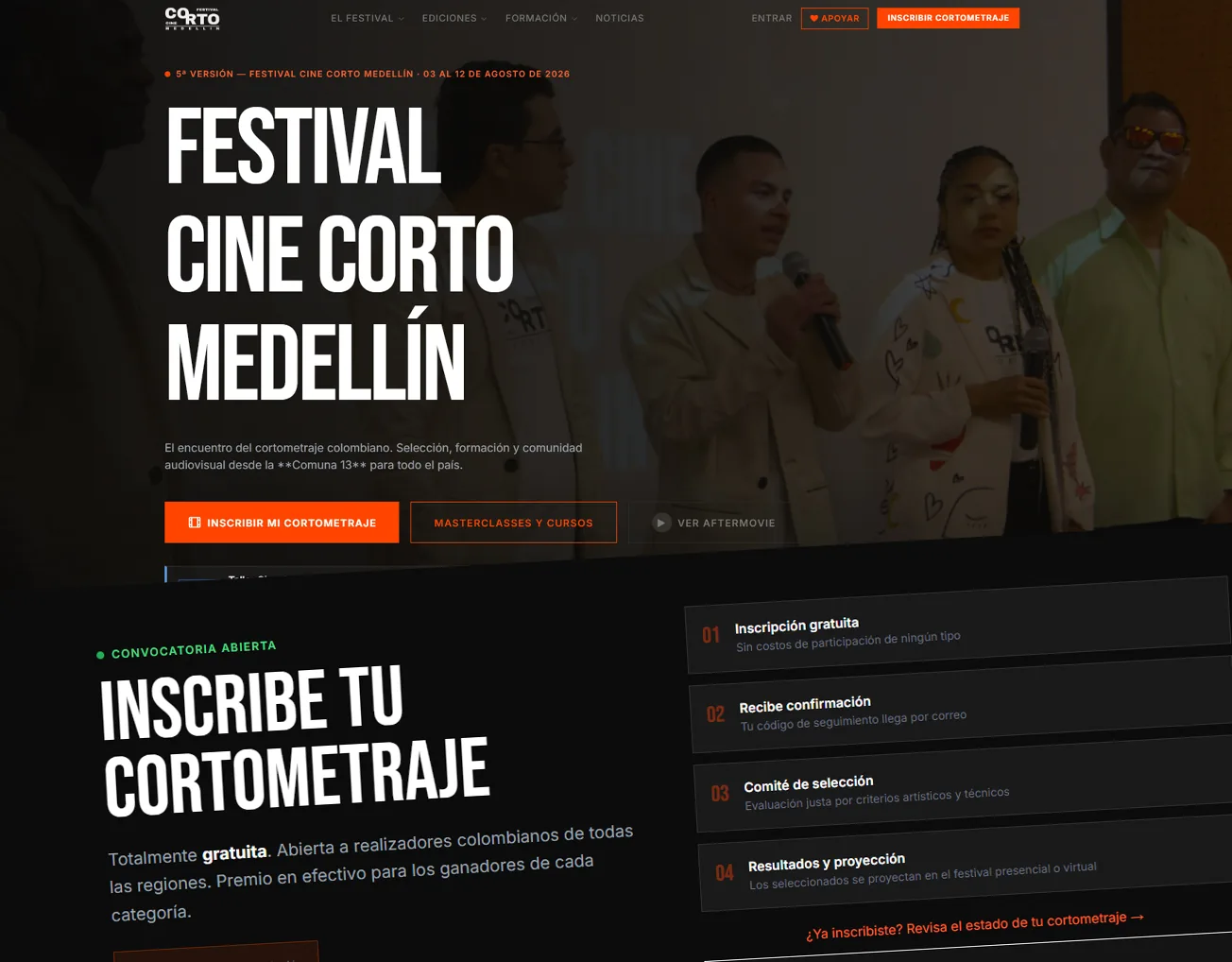
Festival Cine Corto Medellín website
What stands out
PANCA Studio’s reviewed portfolio image shows the Festival Cine Corto Medellín interface with event information and high-contrast orange actions. The visible system uses strong color and type to make a cultural programme feel like a destination instead of a neutral listing. The image also suggests a modular event structure, but it cannot show whether dates, venues, programme changes and archived editions are easy for staff to manage. It is an official portfolio visual and is presented here as visual evidence, not as a claim about attendance, ticket sales, accessibility or every contributor’s role. Its strongest lesson is the relationship between identity and urgent information: a festival can keep a distinctive voice while still making the current programme and next action obvious. The live workflow and mobile states require separate inspection.
Turn the visual energy into an event-content test. Give the team one film with several screenings, a venue change, an accessibility note and an external booking link; ask an editor to publish and correct it. Then test how a phone visitor reaches the right date and receives confirmation. Clarify PANCA Studio’s precise role, the archive strategy and who supports urgent changes during the festival. Identity should strengthen the hierarchy while programme accuracy, keyboard use, contrast and fallback links remain acceptance requirements.
03 / Sodecompany
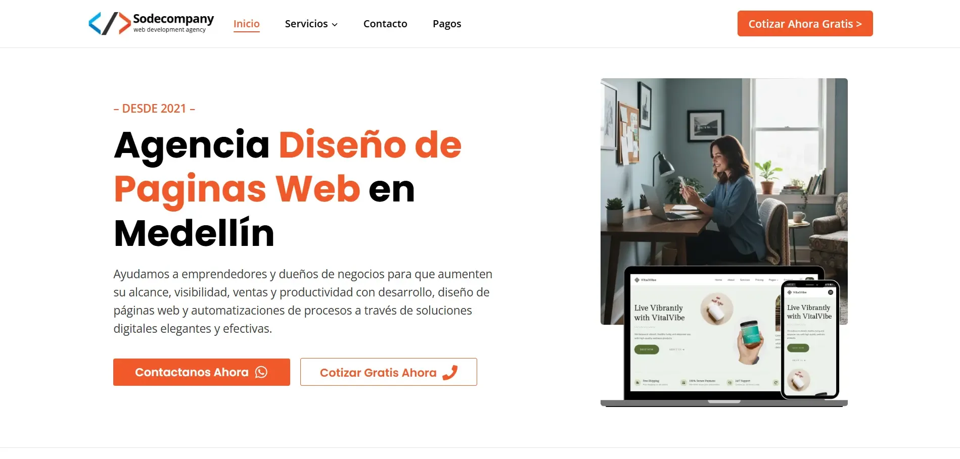
VitalVibe responsive website presentation
What stands out
Sodecompany’s official homepage hero presents a VitalVibe website mockup on a phone and laptop. The paired devices make responsiveness part of the public promise and let a buyer compare hierarchy at two widths. Because this is a composed hero graphic rather than an independent capture of a live deployment, it cannot establish how the interface behaves between those sizes, how fast it loads, whether forms work or what role Sodecompany held in the visible concept. The image remains useful as a review prompt: the main message, navigation and action should retain their relationship when space changes, instead of merely shrinking a desktop canvas. Its publication on the studio’s own homepage establishes provenance, while all claims about implementation, outcomes, accessibility and maintenance still require direct confirmation.
Do not accept two polished device mockups as responsive QA. Test the actual templates at narrow, medium and wide sizes with long Spanish headings, validation errors, keyboard focus and realistic images. Follow the inquiry or purchase action through its receipt, and measure performance on an ordinary phone connection. Ask Sodecompany which visible parts are live work and which are presentation composition, then record browser support, content editing and post-launch fixes in the proposal. The transferable lesson is consistent hierarchy across devices, verified in use.
Questions before you choose
What should a Colombian buyer verify after finding a visually impressive local website example?
First identify whether the image represents a live website, a portfolio crop or a presentation mockup. Open the official page and test the task that matters: search and booking for tourism, dates and sessions for an event, or inquiry submission for a service business. Check the mobile layout with real Spanish copy, slow-network behavior, keyboard access, error messages and the confirmation after a form. Ask who wrote the content, built the interface, hosts it and maintains it. Request the relevant scope and acceptance criteria rather than assuming that every visible element was delivered by one studio. Finally, confirm analytics ownership and the handoff of domains, source files and credentials. Keep that evidence with the brief so later decisions about transactions, events and responsive presentation can be reviewed against the same standard.
What these examples show together
These three records work best as a comparison set rather than a podium. SingleClick gives a concrete booking-interface reference, PANCA shows how an event can turn information into a strong visual destination, and Sodecompany demonstrates responsive presentation across devices. Their public images do not establish conversion rates, accessibility conformance, project scope or current maintenance quality. Open each official source, identify the task closest to your brief, and ask to inspect that task on a live mobile page. A Colombian shortlist should then be evaluated with the same content inventory, acceptance checks, language requirements and ownership terms. That method preserves the inspiration while preventing a polished screenshot from substituting for procurement evidence. Before appointing anyone, write the lesson about transaction, event publishing and responsive service presentation into one comparable task, request the evidence each finalist will provide, and name the client-side owner who can accept it. That final step keeps the Colombia references connected to the actual project rather than to a gallery preference.
How to use this collection
Use the references to discuss hierarchy, content, interaction and production choices with your team. A strong visual direction still has to fit the audience, editing workflow, accessibility requirements and business task in your own brief.
This is an editorial inspiration collection, not an audited ranking or a claim that Dardo created or measured the featured work. Names, images and links are credited to their published sources and were reviewed on the date shown above.
Plan a project with Dardo
Plan a project for Colombia
Choose a review date and a time in Bogotá to see the corresponding local time. This is a planning aid, we’ll confirm availability when we reply.
America/Bogota — Representative time zone; some countries have more than one. Check the actual city and agree on a working window. Dates include seasonal clock changes through your browser’s time-zone data.
Budget currency to discuss: COP. The project calculator lets you enter your own rate. It does not convert exchange rates.
Let’s make it happen.
Send your result and project details directly to Dardo. We’ll review them and reply to your email. Review the included details below before sending.
Prefer email? hello@dardo.studio
Sources & further reading
Sources behind this guide, with further detail from the original publishers.
- De Turismo por Colombia booking interface — official source singleclick.com.co
- Festival Cine Corto Medellín website — official source panca.studio
- VitalVibe responsive website presentation — official source sodecompany.com.co