Replace generic promises with inspectable work
Cover the logo and read the page as a prospective client. Can you identify the audience, offer and reason for each visual? Dardo’s A medio tono project below makes those decisions visible through actual screens and a stated scope.
| Generic claim | Useful evidence |
|---|---|
| A unique experience | Explain one specific interaction and its purpose |
| Built to convert | Show the actual inquiry flow; measure outcomes separately |
| For ambitious brands | Name the audience, situation and deliverables |
The test applies whether software assisted the work or not. A persuasive case page credits the actual role, explains the design choices and lets the visitor inspect the next step. It does not need invented conversion claims.
- 01Audience
- 02Idea
- 03Craft
- 04Working site
Describe the pattern, not a technology
AI slop is a quality pattern: copy that could describe any company, images that carry no relationship to the offer, identical page structures, inflated adjectives, invented proof and a call to action that arrives before the reader understands the work. A page can be hand-written and still be slop, while a page that used an AI tool can become useful after responsible research, editing and design. Google’s guidance says generative AI can help research a topic or add structure to original content, but generating many pages without added value may violate its scaled-content-abuse policy. The useful test is therefore not whether a tool was present.
Ask whether the finished page provides original information or analysis, answers a real visitor’s question, gives context for its claims, and makes clear who is responsible for it. Generic language is a symptom of missing decisions. It says ‘we deliver excellence’ where a buyer needs a scope, an example, a limitation and a next step.
Deliberate design is a sequence of decisions
Deliberate design does not mean adding a dramatic animation to every section. It means choosing what the visitor should understand first, which details earn trust, what the interface should let them do, and what the business can maintain. Start with one audience and one situation: a parent comparing music lessons, a product team evaluating a demo, or a founder choosing a studio for a redesign. Define the content hierarchy, the voice, the visual references, the interaction model, the responsive behavior and the handoff. Then make each choice answerable. Why is this image here?
Which fact does this panel clarify? What happens when JavaScript is unavailable? Who updates the course, project or service details? A distinctive color or typeface can help recognition, but it cannot carry an empty proposition. A calm page with precise copy and a well-timed interaction can be more deliberate than an expensive-looking canvas that hides the task. The result should feel specific before the logo is visible.
Read a project scope as evidence
Dardo’s public A medio tono project page identifies a concrete scope: brand naming, web design, development and SEO. It describes the music school’s interface as a path from an invitation to learn, through instrument choices, toward a first class, and shows selected project screens. The official A medio tono site supplies the product context behind that description: an arts and music school with virtual and at-home classes in Bogotá and nearby areas, for children, young people and adults, with instruments, teacher profiles and a route to start through WhatsApp or the directory. Those facts make the design problem inspectable.
Naming can establish a musical world; the interface must still explain the offer, help someone choose a class and make the next contact sensible. This is evidence of published scope and visible work. It is not evidence of a ranking increase, an enrollment increase, revenue or a performance guarantee. A careful case study keeps those categories separate and never turns a project description into a fabricated result.
Use the buyer’s checklist before the moodboard
Before approving a visual direction, ask every finalist the same practical questions. What situation should the website resolve, and for whom? Which pages, content types, languages and integrations are included? Who writes, reviews and owns the facts, images, credits and translations? Which live project shows work comparable to the needed outcome, and what exactly did the studio deliver? What happens on a small screen, with keyboard navigation, reduced motion or a slow connection?
Which parts are editable after handoff, and who maintains dependencies and analytics? How is an inquiry, booking or signup accepted as a working result? If tools assisted research or drafting, what did a person verify, change and take responsibility for? A useful proposal answers these questions with examples and owners instead of hiding behind unlimited revisions. Give all candidates the same brief and ask for one representative page to be explained line by line. A moodboard can reveal taste; the answers reveal whether the team can make taste useful.
Test the finished page as a buyer
Inspect the live page, not only the presentation deck. Start on a phone and ask what the first screen promises before tapping anything. Read a long section and look for a specific audience, deliverable, constraint and proof. Follow the primary link: does it lead to a real inquiry path, a usable product step or another vague slogan? Turn off images or reduce motion to see whether the hierarchy survives. Use a keyboard, test focus states and check that the important text is present in the delivered HTML.
Try a language switch and confirm that the counterpart is genuinely translated rather than a navigation shell. On a project page, open the source link and distinguish an official claim from the studio’s interpretation. A simple specificity test helps: hide the brand name and colors and ask whether the copy and sequence could belong to five competitors. If yes, the team has supplied polish without enough point of view. If the page remains recognizable through its decisions and useful through its task, the design is doing more than decorating a template.
Let tools assist without flattening the work
A tool can help collect questions, compare a source set, outline a page or catch repeated phrasing. It cannot decide which customer constraint is true, whether a project credit is approved, whether a visual belongs to the brand, or whether the contact path actually works. Keep a source ledger and a change history. Verify facts against the original page, remove claims that cannot be supported, add first-hand context, and have the person responsible review the result in both languages. Google recommends accuracy, quality and relevance for automatically generated material and says that context about how automation was used can help when readers would reasonably ask.
That does not require a theatrical confession in every paragraph; it requires honest ownership and sensible disclosure where the process would matter to trust. Do not claim that a site is human-made merely because it feels warm, and do not claim that AI was absent when you do not know. Judge the finished work by its evidence, decisions and usefulness. The tool is part of a process; the point of view belongs to the accountable team.
Turn taste into acceptance criteria
A buyer can turn the feeling of deliberate work into a short acceptance list. The proposition names a real audience and situation. The main page answers the first question without forcing a tour. The examples, credits, service claims and locations are sourced or clearly labeled as interpretation. The hierarchy works on mobile and with a keyboard. Motion has a useful role and a reduced-motion or non-JavaScript path remains understandable. The inquiry, booking or signup produces the agreed receipt.
The editor can update recurring facts without asking for a new design. English and Spanish versions retain the material meaning and link to each other. The team records what was measured, what remains unknown and what is outside the scope. Mark each item pass, partial or unknown with a piece of evidence. This is not a universal design score; it is a way to make a decision reviewable. A polished prototype is not a working result until the person can complete the intended task and the owner can maintain the content. The checklist protects the distinctive idea from becoming a fragile demo.
A deliberate website keeps earning its attention
The strongest defense against generic output is a chain that a buyer can follow: a defined situation, a specific point of view, visible evidence, a readable interface and a working next step. A medio tono is useful as a reference because its public scope connects naming, design, development and SEO, while the school’s own site makes the audience, instruments, Bogotá coverage and starting path inspectable. That is a coherent set of decisions; it does not need inflated claims about what happened after launch. When choosing a studio, ask for the same chain in your own project.
Bring the audience, content owners, required languages, existing routes, constraints and the business action that matters. Ask the team to explain what it knows, what it assumes and what it will measure. A deliberately designed website may use automation, templates or a familiar component library. What makes it worth keeping is the care applied to the decisions: the page says something true, shows why it is true, helps someone act and can remain alive after the launch day.
In practice / A medio tono
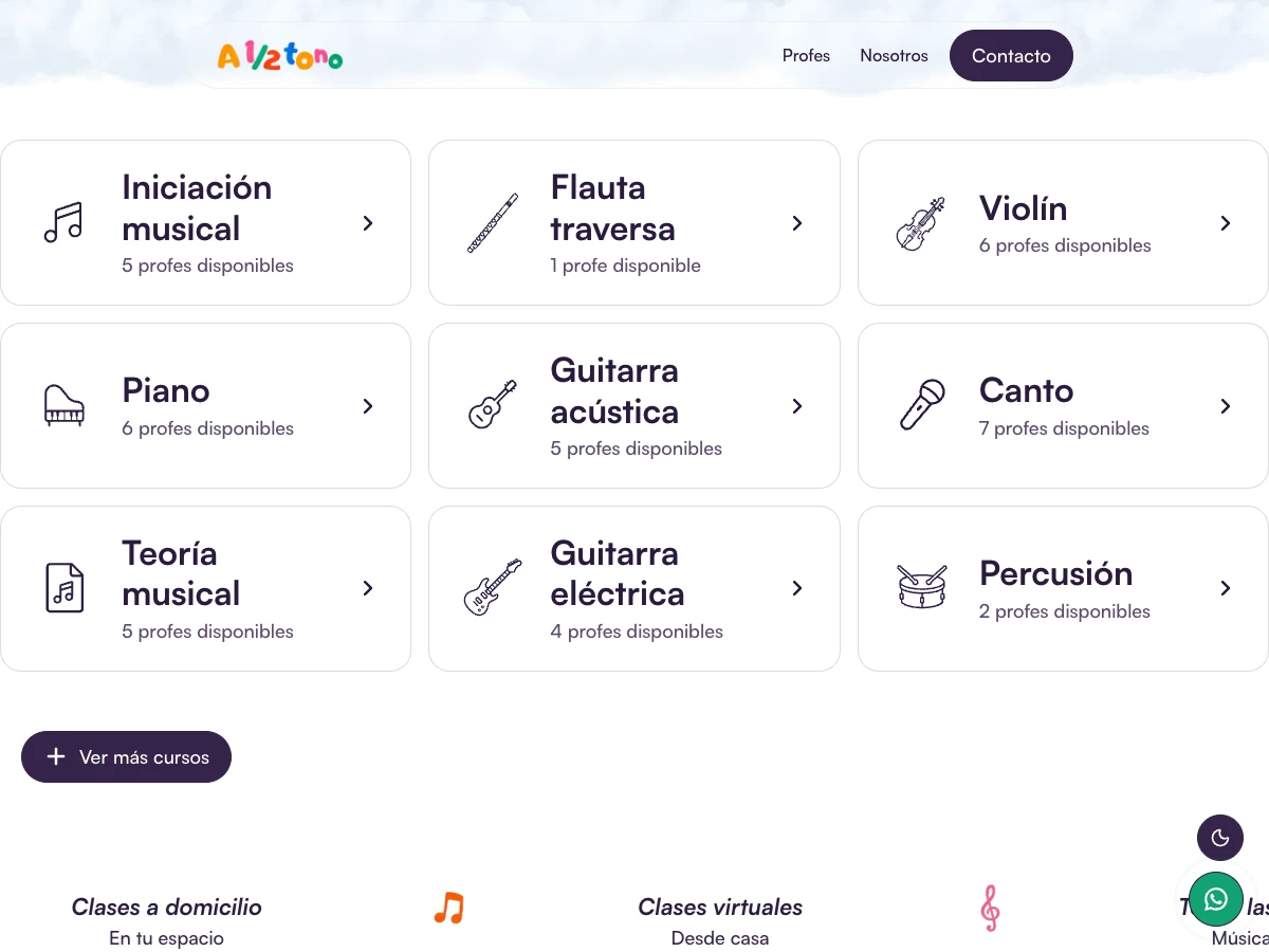
The name carries the musical association. This section does a more literal job: choose a teacher, start learning and understand weekly progress. Teacher cards connect an instrument to a person, while the three steps explain how to begin. These are visible design decisions, not proof of a conversion increase.
Explore the A medio tono projectSources & further reading
Sources behind this guide, with further detail from the original publishers.
- Google Search Central: helpful, reliable, people-first content
- Google Search Central: guidance on using generative AI content
- Google Search Central: spam policies
- Google Search Central: optimizing for generative AI features
- Dardo: A medio tono project scope
- A medio tono: music classes in Bogotá and online
- A medio tono: about the school and its classes